What's new in Swift Release 26 in January?
The January 2026 release focuses on improved portability, design consistency, and data flexibility, with centralized styling and enhanced Swift Objects to streamline app automation development.
Read on to discover the highlights of this release and unlock new possibilities for your app automation journey.
Swift Release 26 – January features the following capabilities:
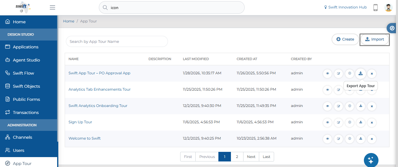
Import/Export in App Tour: Effortlessly move and back up your onboarding experiences with new native Import and Export functionality.
Theme Designer: Establish a centralized "source of truth" for your brand by managing styles, layouts, and modular components in one hub.
Advanced Array Support: Build sophisticated enterprise apps by nesting objects and defining specific data types directly within Swift Object arrays.
Custom Output Configuration: Take total control of your data by mapping specific JSON paths from service responses into your own custom workflow structures.
Icon Customization: Fine-tune your UI by adjusting icon colors, sizes, and stroke weights in real-time without needing external design tools.
So without further ado, let’s dive into the exciting new features we recently released!
App Tour (Import & Export)
In this release, we’ve added native Import and Export functionality to the App Tour module, allowing you to manage your tours with much greater flexibility.
Theme Designer
The new Theme Designer serves as your application's "source of truth" for visual styles. Located under Settings > Theme Designer, this centralized hub ensures brand consistency across every screen of your corporate family.
Key Capabilities
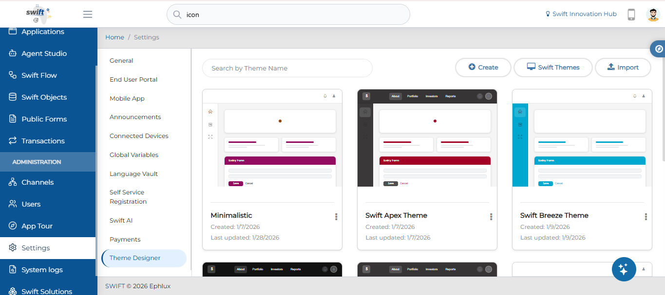
Custom Creation: Start from scratch by clicking the + Create button and naming your theme.
System Baselines: Get a head start with four pre-configured themes:
Swift Breeze: Standard light layout.
Swift Apex: Dark-themed for data-dense UIs.
Swift Prestige: Dark-themed with dropdown navigation.
Swift Glass: Light-themed and headerless.
Management Dashboard: A clean, card-based interface allows you to search themes, track update history, and perform quick actions like Edit, Export, or Delete.
Structural Layouts & Modular Styling
Beyond colors, you can now define the core skeleton of your app. Choose from four distinct navigation styles:
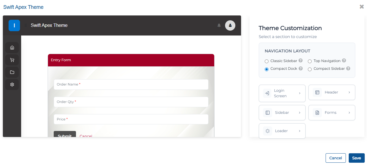
Classic Sidebar: Left sidebar with expandable menus for modules and sub-modules.
Top Navigation: Modules displayed in a top navigation bar with dropdown menus.
Compact Dock: Left sidebar with expandable menus for menus and sub-menus.
Compact Sidebar: Space-efficient sidebar with merged branding and user controls.
You can also independently style these to create a cohesive user experience.
Login Screen: Customize the login screen for a branded and user-friendly experience.
Header: Adjust the header for top-level branding and navigation with options for background color and text color.
Forms: Enhance form elements for better usability.
and Loaders: Configure loading indicators for smooth user feedback during waits.
Advanced Array Support in Swift Objects
Define complex data structures directly at the UI level. The enhanced Array component now supports nested objects and specific data types to meet enterprise integration needs.
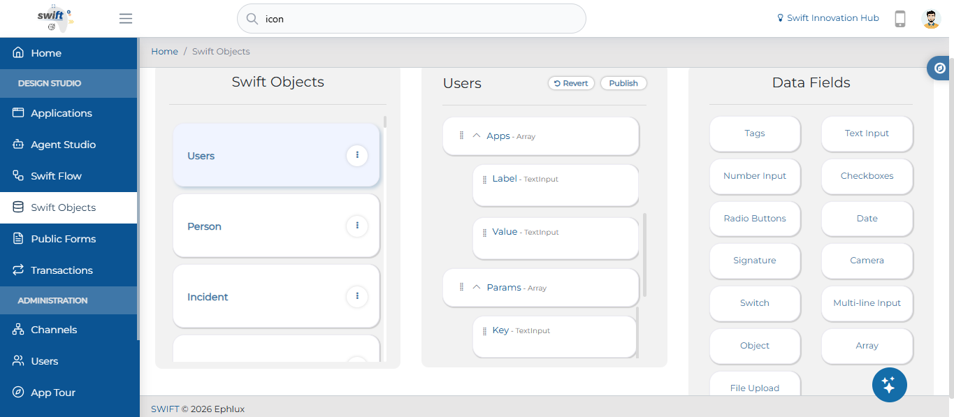
Array of Objects: Build structured data, such as a "Users" list where each entry contains nested "Addresses" or "Job History."
Array of Strings/Numbers: A structured collection of text or numeric values that lets you organize, manage, and manipulate multiple items efficiently. Just drag and drop the Text or Number input field to include it in the array.
This update moves beyond simple lists, allowing you to nest objects and define specific data types within your arrays, providing the flexibility needed for sophisticated enterprise applications.
Custom Output Configuration
Administrators can now customize JSON output structures directly within the Workflow Designer.
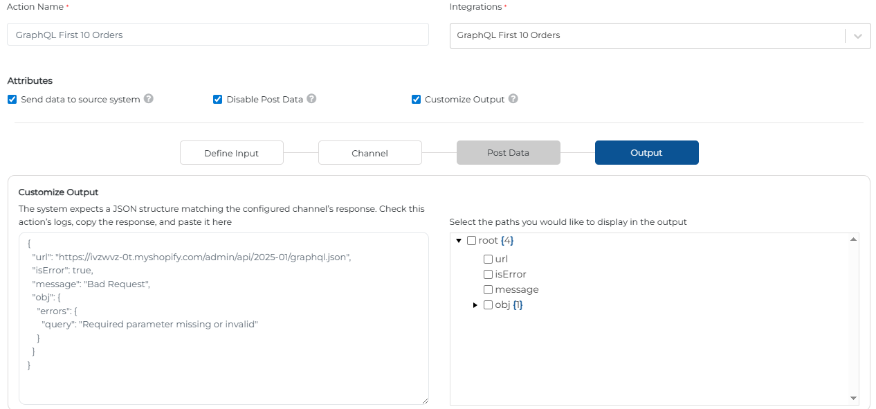
JSON Schema Definition: Paste a response into the "Customize Output" field to create a template.
Dynamic Path Selection: Use a tree-view interface to toggle specific data paths (e.g., root, url) to include in the final output.
Action Attributes: Refine data flow with options to "Send data to source system" or "Disable Post Data."
This feature allows for precise control over the data returned by a workflow action, ensuring compatibility with downstream systems or front-end displays.
Icon Customization
The Select Icon feature now allows for direct property manipulation, ensuring your icon perfectly matches your brand without needing external image editors.
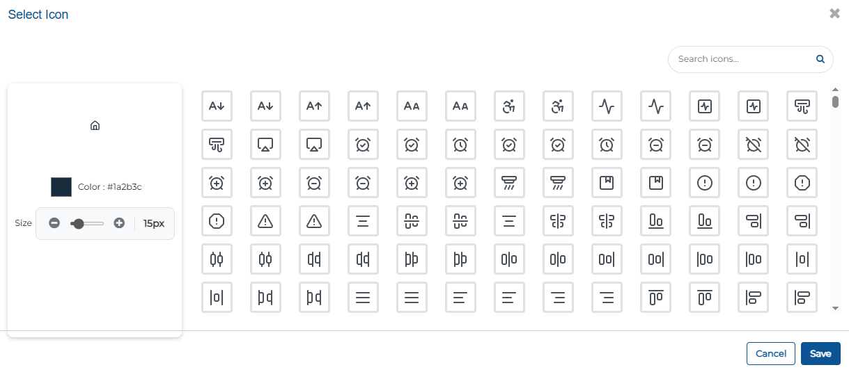
Color Assignment: Easily choose and apply colors that align with your overall theme, ensuring a consistent and visually cohesive design.
Size & Stroke: Use a slider for pixel-perfect dimensions and weight.
Real-time Preview: See your changes instantly in the preview pane.
Wrapping Up
That wraps up our latest updates to Swift!
These enhancements are designed to provide you with more control over your app’s aesthetics and data architecture, helping you build more sophisticated, brand-aligned automation journeys.
📌 Pro Tip: Combine your new Custom Theme Loaders, Advanced Array Objects, and Custom Output Configurations to build high-performance, data-rich interfaces that map perfectly to your APIs while maintaining a seamless, corporate-branded look.
Stay tuned for more innovations, and as always, happy designing with Swift!
Thank you for being a part of the Swift community. Here's to optimizing your processes and achieving success!
With 💙 from Swift
Your feedback is essential in driving us forward, so please don't hesitate to share your thoughts with us, and stay tuned for more groundbreaking features as we evolve!