Visible Attribute
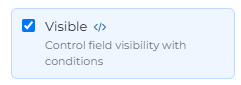
The Visible attribute controls whether a component is displayed to the end-user. Beyond a simple on/off toggle, it features a powerful Condition Builder (accessed via the code </> icon) that allows for dynamic UI behavior based on real-time data.
1. Basic vs. Conditional Visibility
Checkbox: Simply checking or unchecking the box sets a static visibility state.
Condition Builder </>: Clicking this icon opens a modal where you can define specific logic. When conditions are met, the component appears; otherwise, it remains hidden.
2. Logic Configuration
To create a visibility rule, you must define the following:
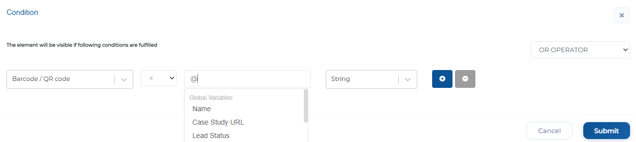
Source Selection: Choose the data point that triggers the logic. The dropdown categorizes these into:
Form Fields: Values entered into other components on the current screen (e.g., Order Type or Branch/Plant).
Global Variables: Account-wide constants (e.g., Lead Status).
User Parameters: Data specific to the logged-in user (e.g., Business Unit or Supplier Number).
Operator: Select the comparison method (e.g., =, !=, >, <).
Value: Enter the specific value required to trigger visibility. You can use the @ symbol to compare one field's value against another dynamic variable.
Data Type: Ensure the system evaluates the data correctly by selecting the appropriate format: String, Number, Boolean, or Date.
3. Advanced Multi-Rule Logic
For complex business requirements, you can add multiple rows of logic using the plus (+) button:
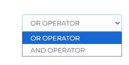
AND Operator: The component will only be visible if all defined conditions are true.
OR Operator: The component will be visible if at least one of the defined conditions is true.
Next time you're fine-tuning your interface, don't forget about the Visible Attribute – Click, customize, and confidently master your UI challenges like a pro!